UI Addons
Overview
The UI Addons section allows you to enhance the user experience of your web app by adding interactive elements that make it feel more like a native application. Features such as pull-down refresh, navigation tab bars, dark mode, and toast messages contribute to a more engaging and intuitive user interface.
1. App Navigation Menu
What is the App Navigation Menu?
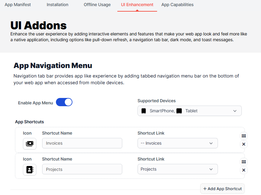
The navigation tab bar provides a tabbed menu at the bottom of your web app, facilitating easy navigation when accessed from mobile devices.
Configuration Options
Enable App Menu
- Description: This toggle allows you to activate or deactivate the app navigation menu.
- Impact: Enabling the app menu enhances user navigation, making it easier for users to access various sections of your app quickly.
Supported Devices
- Description: Select the devices that will support the navigation menu.
- Impact: Ensuring compatibility across devices ensures a consistent user experience, whether on smartphones or tablets.
Shortcut Name
- Description: Specify the name for the shortcut that users will see.
- Impact: A clear and descriptive shortcut name helps users understand the purpose of the shortcut, improving usability.
Shortcut Link
- Description: Define the link associated with the shortcut.
- Impact: Directing users to the correct section enhances navigation efficiency.
Add App Shortcut
- Description: Use this button to add multiple shortcuts as needed.
- Impact: Providing multiple shortcuts allows users to personalize their navigation experience, making frequently used features easily accessible.
2. Scroll Progress Bar
What is the Scroll Progress Bar?
The scroll progress bar visually indicates the percentage of the page the user has scrolled through.

Configuration Options
Enable Scroll Bar
- Description: Activate or deactivate the scroll progress bar feature.
- Impact: A scroll progress bar enhances user awareness of their position on the page, improving navigation and reducing disorientation.
Supported Devices
- Description: Choose which devices will display the scroll progress bar.
- Impact: Ensuring compatibility across devices enhances the overall user experience.
3. Dark Mode
What is Dark Mode?
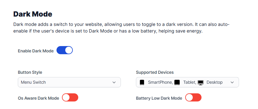
Dark mode provides a switch that allows users to toggle to a darker theme, which can be easier on the eyes, especially in low-light conditions.
Configuration Options
Enable Dark Mode
- Description: Toggle to activate or deactivate the dark mode feature.
- Impact: Offering dark mode caters to user preferences and can help reduce eye strain.
Button Style
- Description: Choose the style of the button that users will use to toggle dark mode.
- Impact: Customizing the button style ensures it aligns with your app's overall design aesthetic.
Supported Devices
- Description: Select which devices will support dark mode.
- Impact: Ensuring device compatibility guarantees that all users can take advantage of this feature.
OS Aware Dark Mode
- Description: This option enables dark mode to auto-activate based on the user's device settings.
- Impact: This feature enhances usability by respecting user preferences set at the operating system level.
Battery Low Dark Mode
- Description: Automatically enable dark mode when the user's device battery is low.
- Impact: This feature helps extend battery life on mobile devices, enhancing user satisfaction.
4. Pull Down Refresh
What is Pull Down Refresh?
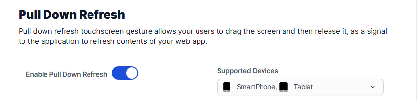
The pull-down refresh feature allows users to refresh the content of your app by dragging the screen down and releasing it.
Configuration Options
Enable Pull Down Refresh
- Description: Toggle to activate or deactivate the pull-down refresh functionality.
- Impact: This gesture-based interaction mimics native app behavior, enhancing user engagement and familiarity.
Supported Devices
- Description: Specify which devices will support the pull-down refresh feature.
- Impact: Ensures that users on various devices can utilize this interactive feature.
5. Page Loader
What is the Page Loader?
The page loader feature displays an animation while content is loading, indicating to users that the app is processing their request.

Configuration Options
Enable Page Loader
- Description: Activate or deactivate the page loader feature.
- Impact: A loader provides visual feedback during loading times, improving user experience and patience.
Loader Style
- Description: Choose the style of the loader animation.
- Impact: Customizing the loader style allows it to fit within your app’s design, enhancing overall aesthetics.
Supported Devices
- Description: Select which devices will display the page loader.
- Impact: Ensuring compatibility across devices helps maintain a consistent user experience.
6. Shake Refresh
What is Shake Refresh?
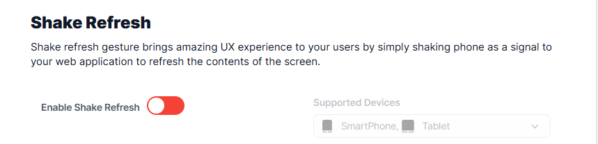
The shake refresh feature allows users to refresh the app's content by shaking their device.
Configuration Options
Enable Shake Refresh
- Description: Toggle to activate or deactivate the shake refresh functionality.
- Impact: This unique interaction enhances user engagement by providing a fun and intuitive way to refresh content.
Supported Devices
- Description: Specify which devices will support the shake refresh feature.
- Impact: Compatibility ensures all users can enjoy this interactive feature.
7. Toast Message
What is a Toast Message?
Toast messages are brief notifications that provide feedback about an operation. They appear temporarily and do not interrupt the user’s activity.

Configuration Options
Enable Toast Message
- Description: Activate or deactivate the toast message feature.
- Impact: Toast messages enhance communication with users, providing timely feedback without disrupting their experience.
Supported Devices
- Description: Choose which devices will support toast messages.
- Impact: Ensures that all users receive important notifications effectively.
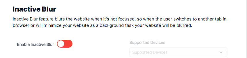
8. Inactive Blur
What is Inactive Blur?
The inactive blur feature blurs the app when it is not in focus, indicating to users that the app is inactive.
Configuration Options
Enable Inactive Blur
- Description: Toggle to activate or deactivate the inactive blur feature.
- Impact: This visual cue helps users understand the app's status when they switch to another tab or minimize it.
Supported Devices
- Description: Specify which devices will support the inactive blur feature.
- Impact: Compatibility ensures that all users can benefit from this feature.
Conclusion
The UI Addons in the PWA module for Perfex CRM significantly enhance user experience by providing interactive elements that mimic native app behaviors. By configuring these features, you can create a more engaging and user-friendly application that meets modern expectations.